Handwriting curriculum with reference and practice sheets, print through cursive
(downloads available as PDFs on Google Drive)
Writing 101
Basic Print
Transition
Phonics Writing
Practice Sheets
Cursive
Numbers
Notes
Download printable, complete penmanship booklet sets
for this entire curriculum:
Complete penmanship booklet
Cyan writing sheets | Magenta writing sheets
Download printable, dotted-lined, blank writing sheets
as a necessary part of this writing curriculum:
(if you don’t have your own)
24-line small (blank writing sheets)
(Cyan) | (Magenta) | Gray: (Dark) (Light) | (Black)
…and you can keep reading to find more downloads…
Writing 101
Intro to 5 fonts | Intro to Roman fonts | Fontology–fonts.com
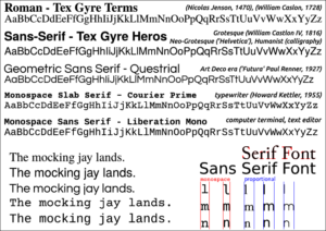
 Machine-printed fonts should be readable, depending on their purpose. Usually, avoid geometric sans serif and modern Roman fonts in large blocks of text (like articles, essays, and letters) because their letters are too similar and difficult to read quickly. Instead, use normal sans serif and Roman fonts in large blocks of text and reserve geometric sans and modern Roman fonts for titles and headings.
Video: Fonts
Handwriting styles should be easy to write quickly and be easy to recognize. Handwriting and fonts should be different.
Never model your handwriting after a Roman or sans serif font!
Sadly, many early to mid 1900’s handwriting curricula teach geometric sans font-style for handwriting, but this is a mistake. If you want to write with a geometric sans font-style, that is an artistic style of writing that you should learn after first learning the natural writing style.
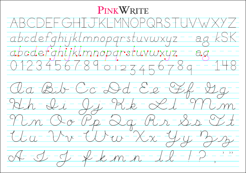
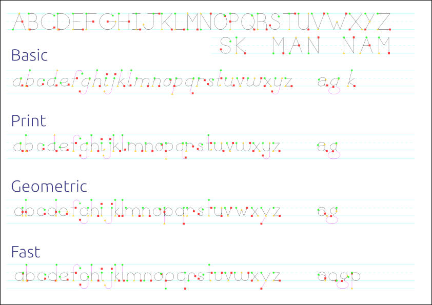
Why ‘Basic’ & Print Letters?
These “Basic” letters are intended to aid both printed and cursive writing practice, doubling as core practice for both writing skill levels. The Basic letters are slanted in anticipation of cursive, and many letters either have identical core components as cursive—such as: a, d, c, g, h, o, p, q—or contain principle proportions in size—such as: b, e, f, i, j, k, l, m, n, r, s, t, u, v, w, x, y, z. Even Basic k and z have overlapping sizes with their cursive styles.
With this method, “Basic” letters followed by “Cursive Prep Curves” prepare students to write cursive quickly and well.
*Teaching tip: The following two charts are for reference, to help students see how writing styles can differ. This are not intended for significant teaching time. After learning to write the “Basic” letters, students may be interested in learning some of the alternate writing methods on their own initiative.
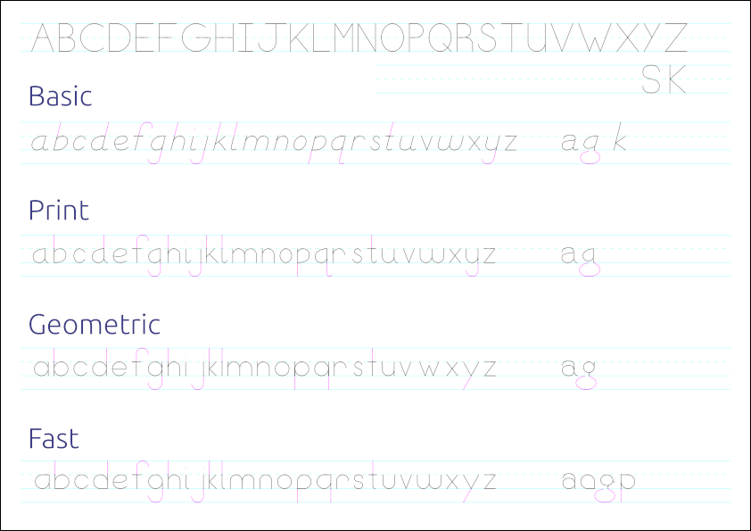
Note: “Print” is the same as “Basic”, but not slanted. The trailing “a” and “g” are “double story” versions as they would be written by hand. Usually, these are only seen in fonts, especially Roman. Other letters include alternate methods of writing.
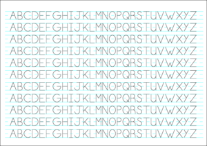
5 writing styles (lined): Capital, Basic, Print, Geometric, Fast
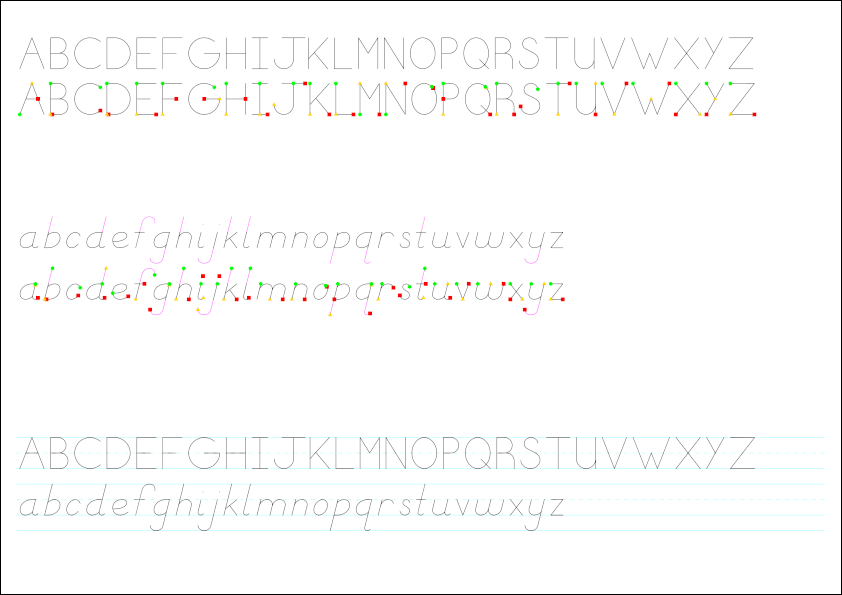
The ‘What’ and ‘Why’ of ‘Guide Dots’
“Guide dots” are colored and shaped to indicate important “nav points” of stroke order. This is an alternative to using arrows and numbers, as in handwriting curricula developed through the 20th century.
“Guide dot” order is: 1. start on the green circle, 2. write to the yellow triangle as directly as possible, and 3. complete the rest of the letter so to end on the red square.
“Guide dots” are not intended to teach students by themselves. Handwriting requires observation and coaching from an instructor or a “floating” teacher in the classroom. These colored “guide dots” serve as key reminders for students who need to practice remembering stroke order in order to write correctly.
By using colors and shapes, rather than arrows and numbers, the curriculum focuses solely on the art-centers of the brain, not requiring math-logic centers of the brain, so as to consolidate neural resources and thus speed up learning. Writing is an art and should remain that way throughout the learning process. This approach presumes that requiring students to consider math and numbers while practicing an art would divide focus of the brain and, though it may make early stages of writing appear to progress more quickly, using numbers would slow students progress over the long run. By using only colors and shapes as “key reminders” rather than “comprehensive instructions”, most students should require more effort (never a bad thing in learning) to adjust and remember in the early stages, but should progress more quickly and with more quality over the long term.
These “guide dot” sheets could be printed in grayscale to lower costs (because shades of gray are distinguishable and clear shapes are retained), but color is best for the art-centers of the brain. The most economical approach is one colored version of each sheet per student, then grayscale versions if students require repeated practice; wall-sized classroom charts should always be in color. The first of each sheet per student and all wall charts in a classroom must be in color as legal condition of “PinkWrite™” brand-name licensing for any PinkWrite™ -licensed teacher or instituted school. Of course, do-it-at-home students don’t have this requirement since the material itself is free and open, though it is still advisable.
5 writing styles (guide dots): Capital, Basic, Print, Geometric, Fast
‘Basic’ Print Letters
Beginning Guide Dots
(to demonstrate stroke order)
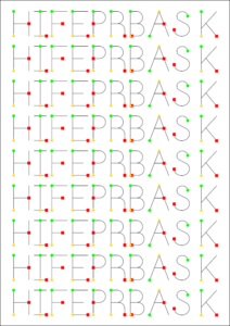
Guide dots for 2 writing styles: CAPITAL & Basic
(with NAM-MAN difference & alternate letters/orders)
 Especially for young learners, but for everyone, color-coded shapes can help you learn the stroke order.
Start with the green circle, then the yellow triangle is your next destination. Stop at the red square and figure out everything in between.
Video: Penmanship
Video: Handwriting Strokes
Start with a few simple capital letters, then all capital letters, then work to lowercase, starting with carry-over letters p-a-g-e-s-n-d-t.
Best practice order:
H I F E P R B A S K
Caps (all)
pages send tags
*Teaching tip: These Guide Dots are intended to help young learners develop instinctive stroke order (learning by rote practice) while gaining muscle control in the hands. Move on to Transition Sheets when the learner’s hand is strong enough to make semi-recognizable letters without the Guide Dots. Moving-on is a “muscle strength” question…
The next step is to properly write letters correctly within lines.
Transition Sheets
(lined with colored ascenders & descenders)
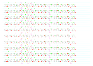
10-line large basic letters a-z with guide dots
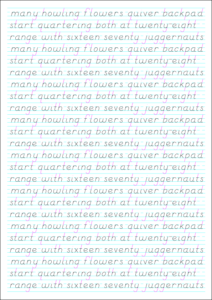
24-line “range back sixteen seventy juggernauts”
(focus on: a, g, b, e, s, plus i, j, and t to cross and dot) 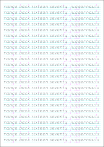
24-line a-y diverse text
(a-y in three lines to practice)
*Teaching tip: For young learners, use any Transition Sheet (above) or Lined Practice Sheet (below) in combination with a blank Lined Practice sheet (below). First give a “test” with the blank sheet, second return to the sheet with letters, repeating this blank-transition pattern to quickly learn.
Lined Practice Sheets (print):
11-line large (CAPITAL) (Cyan) | (Magenta) | Gray: (Dark) (Light)
10-line large (basic letters) (Cyan) | (Magenta) | Gray: (Dark) (Light)
10-line large (blank) (Cyan) | (Magenta) | Gray: (Dark) (Light) | (Black)
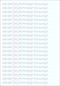
21-line small (basic letters) (Cyan) | (Magenta) | Gray: (Dark) (Light)
21-line small (blank) (Cyan) | (Magenta) | Gray: (Dark) (Light) | (Black)
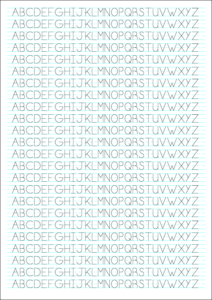
24-line small (CAPITAL) (Cyan) | (Magenta) | Gray: (Dark) (Light)
24-line small (blank) (Cyan) | (Magenta) | Gray: (Dark) (Light) | (Black)
Frequent Letters (print)
a tear (Cyan) | (Magenta) | Gray: (Dark) (Light)
e (Cyan) | (Magenta) | Gray: (Dark) (Light)
rnv (Cyan) | (Magenta) | Gray: (Dark) (Light)
s (Cyan) | (Magenta) | Gray: (Dark) (Light)
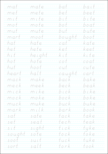
Phonics Writing
After learning to write basic print (above) and to read long and short vowel words, connect phonics and writing with this 24-line phonics writing sheet:
24-line small phonics (Cyan) | (Magenta) | Gray: (Dark) (Light)
Cursive
Take one day to learn the skill you will use every day of the year and you have learned the entire year in one day.
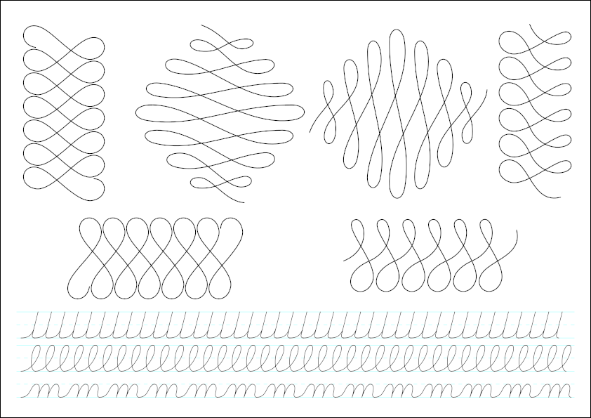
Prepare for cursive by drawing decorative “cursive prep” curves on blank paper, then repeat lowercase letters—”l” loops & “m” on lined paper. Eventually, after all letters are learned, cursive should be written without any lines, on blank paper.
*Teaching tip: Curvy is key! Writing decorative loops first prepares the hand for writing ALL letters, making the process easier than less curvy cursive styles. Loops first, then all cursive lowercase letters at once, finally all capitals at once; then practice “trouble letters” as they crop up in daily practice of the entire alphabet.
Cursive Prep Curves
 *Teaching tip: The PinkWrite Cursive™ style is not how letters are “expected” to be written, but how letters are “attempted” to be written. Writing letters exactly this way should prove impossible, but by “trying their best to write as similarly as possible”, students will develop a style that is consistent, artful, and unique. In a tested academic scenario, students should be scored on their ability to demonstrate: 1. awareness of the style’s properties (including proportion to baseline, x-height median line, and cap height line—usually in halves or thirds), 2. demonstrable improvement over time (teachers must thus retain practice sheets), and 3. “fluid-relaxed” muscle control consistency of “learned auto-curves”, loops and other recurring stroke elements, and ability to write these in a semi-straight manner without lined paper.
PinkWrite Cursive™
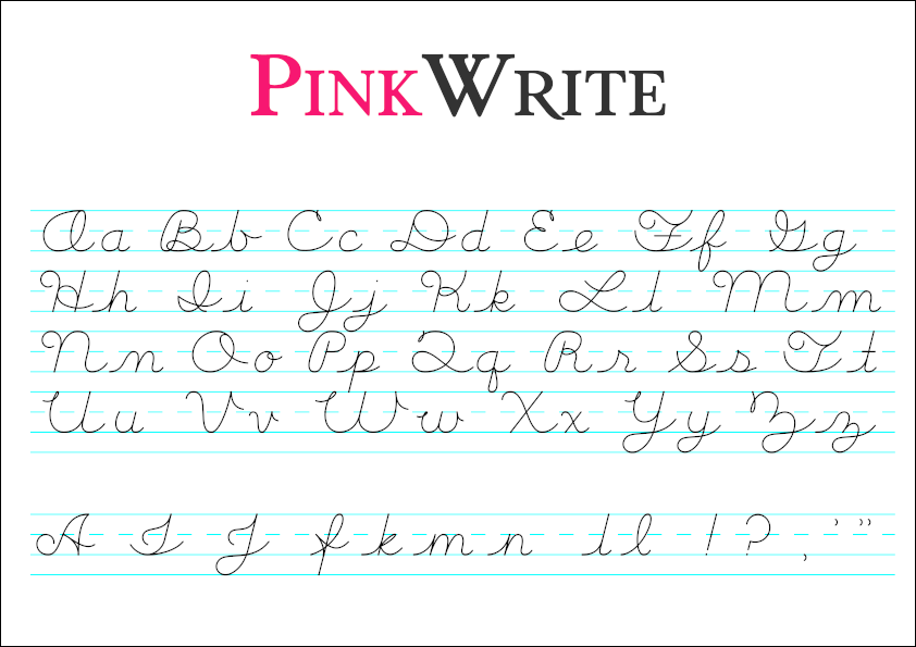 Alternate versions of letters and first special characters are on the bottom line:
A I J fkmn ll !? , ‘ “
Read the Notes on Starting Capital Cursive Curves.
Here is a banner, such as for a classroom: Cursive – all one line.pdf
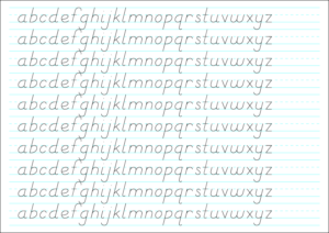
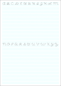
Lined Practice Sheets (cursive):
All lines are the same height, paper orientation optimizes use of space.
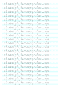
Cursive (lowercase a b ) (Cyan) | (Magenta) | Gray: (Dark) (Light)
Cursive (lowercase d f ) (Cyan) | (Magenta) | Gray: (Dark) (Light)
Cursive (lowercase g q ) (Cyan) | (Magenta) | Gray: (Dark) (Light)
Cursive (lowercase k p ) (Cyan) | (Magenta) | Gray: (Dark) (Light)
Cursive (lowercase o z ) (Cyan) | (Magenta) | Gray: (Dark) (Light)
Cursive (lowercase r s ) (Cyan) | (Magenta) | Gray: (Dark) (Light)
Cursive (lowercase v ) (Cyan) | (Magenta) | Gray: (Dark) (Light)
Cursive (lowercase) (Cyan) | (Magenta) | Gray: (Dark) (Light)
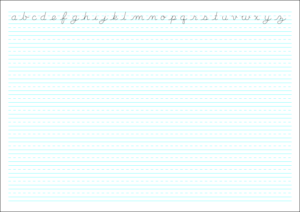
Cursive (CAPITAL) (Cyan) | (Magenta) | Gray: (Dark) (Light)
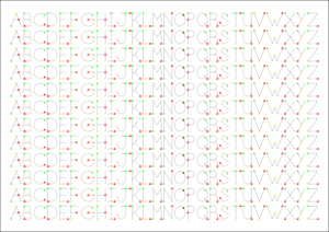
All-Styles Print Guide Dot Chart
Once you have learned the print and cursive letters, it doesn’t hurt to try to learn a Geometric or Fast way of writing. Use this sheet to guide you through stroke order for all five print styles…
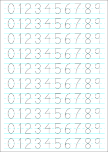
Numbers
Overview: Lining Figures & Old Style Figures
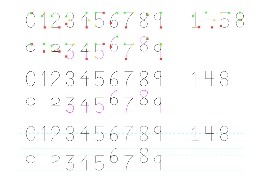
10-line large (0-9) Guide Dot Numbers
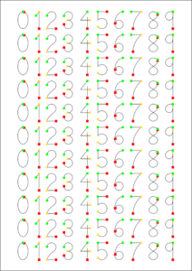
10-line large (0-9) (Cyan) | (Magenta) | Gray: (Dark) (Light)
Notes
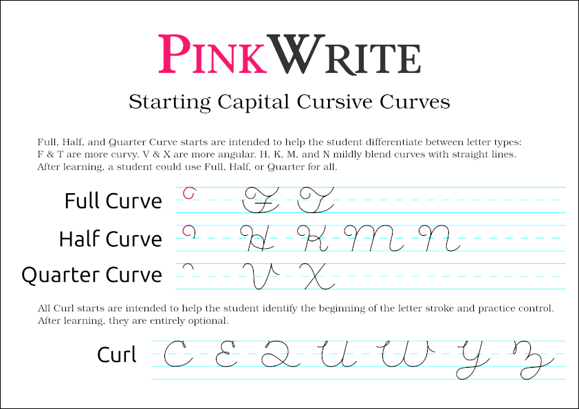
Full, Half, and Quarter Curve starts are intended to help the student differentiate between letter types: F & T are more curvy. V & X are more angular. H, K, M, and N mildly blend curves with straight lines. After learning, a student could use Full, Half, or Quarter for all.
All Curl starts are intended to help the student identify the beginning of the letter stroke and practice control. After learning, they are entirely optional.
D’Nealian
D’Nelian was introduced in the late 1900s. “Manuscript” flowing print in first grade prepared students for a similar cursive the following year. This was a strong improvement over starting with “block letters” (handwritten Geometric Sans), then moving directly to cursive.
The PinkWrite writing script curriculum follows the principles of flowing print, but removed the controversial “monkey tails” from the first year “Basic” letters and made more artful cursive the second year. Flowing, curving cursive may seem more difficult if tracing, but if students learn to draw curves first, a curving cursive is actually easier to write, even for young students.